Graphic Design
_
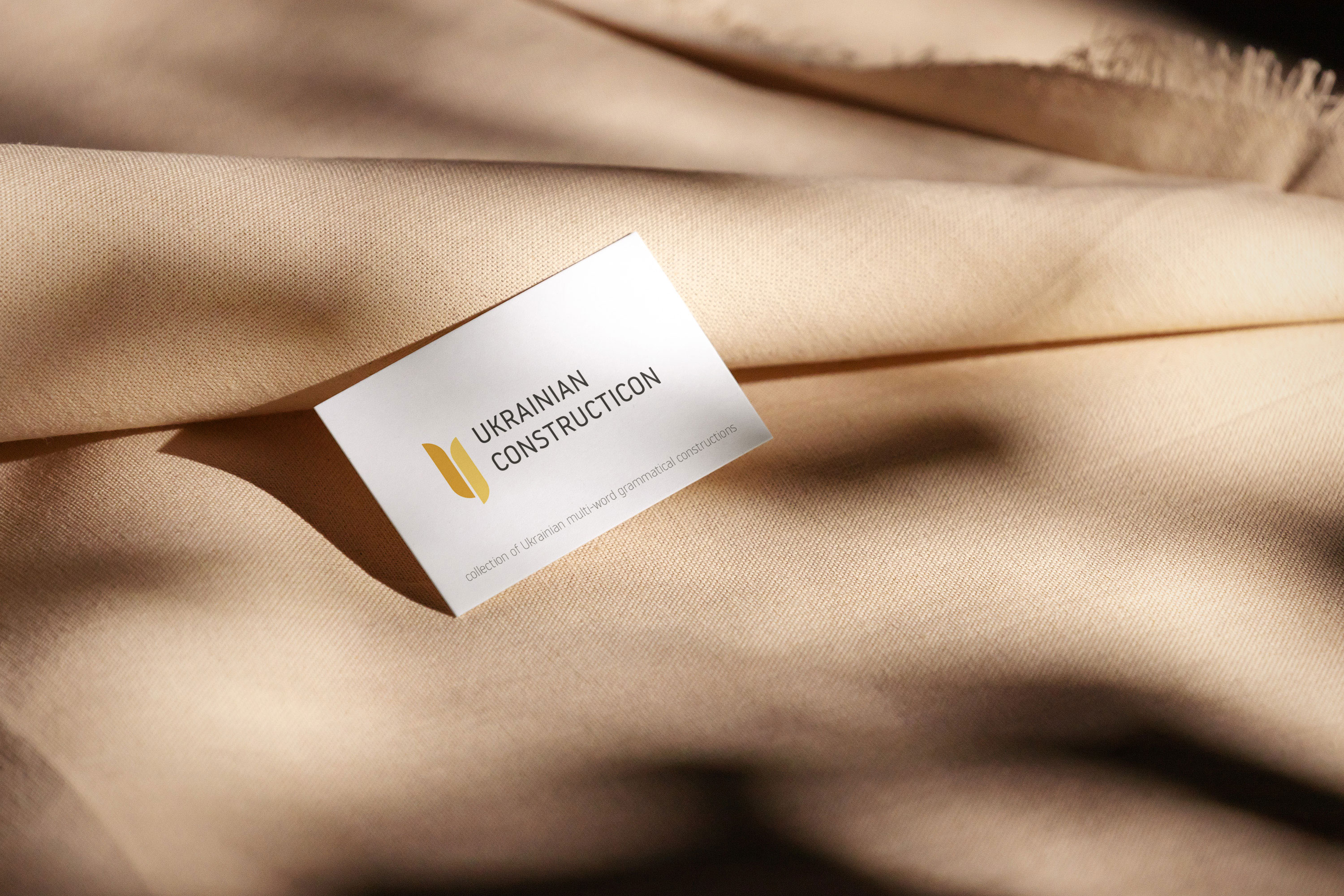
Ukrainian Constructicon Logo
Logo I have made for a UIT - The Arctic University of Norway. The Ukrainian Constructicon (UkrCon) is a collection of Ukrainian multi-word grammatical constructions, i.e. prominent linguistic patterns of phrase and sentence structures that are characteristic of the Ukrainian language.
I have created a Logo which consists of 2 elements. Element resembling wheat symbol which should connect this logo with Ukraine, and accompanying logotype - Ukrainian Constructicon.
_
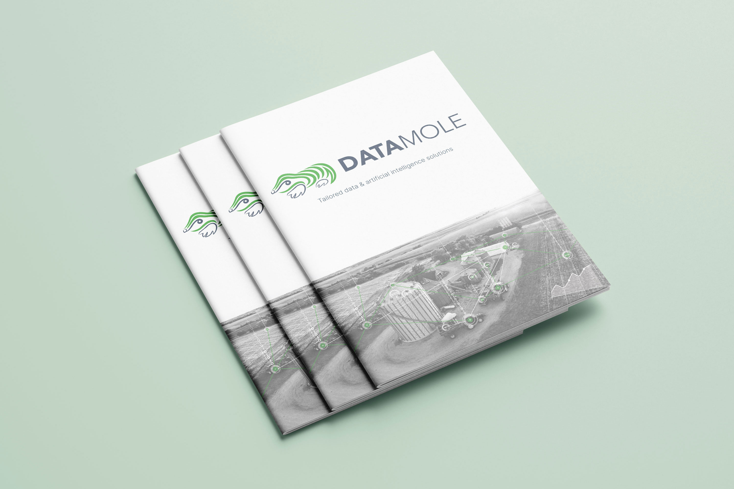
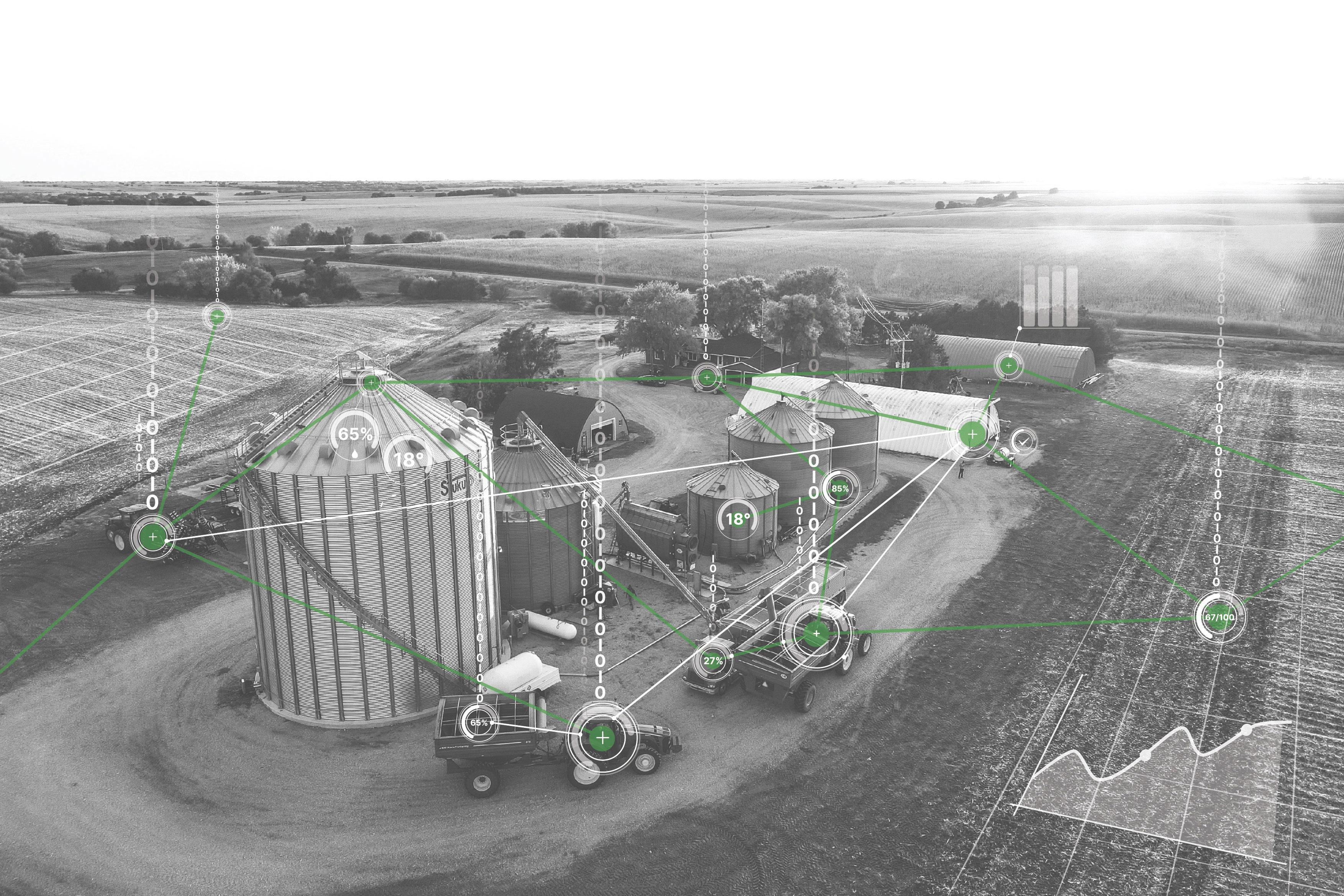
Expo brochure and custom overlay illustration for Datamole
Since October 2022 I am a contract graphic designer for tech and artificial intelligence company Datamole where I am creating all graphic materials for different media platforms, printing etc. Also co-operating with teams on developing app UIs.
This project was to create a new brochure for an upcoming expo that Datamole was attending. I have created a custom overlay illustration for a cover page and whole cover page redesign for a more modern and minimalistic look. and then also reworked the content visual.
_
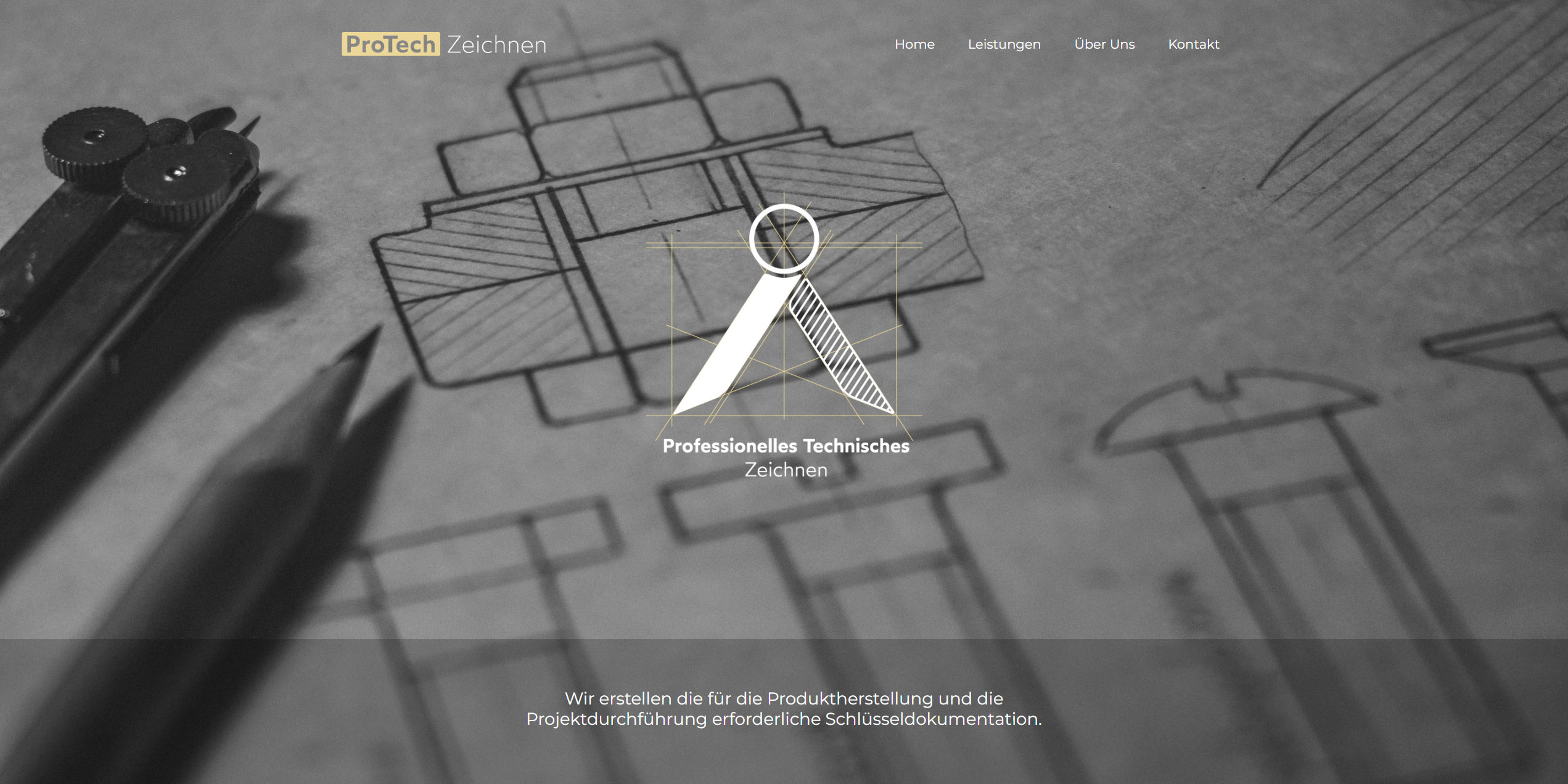
Protech Zeichnen Logo + website design
Newly emerging German company has asked me to come up with a logo and website design for them. The main focus point of the company is to create technical drawings for different areas in industry engineering.
Main element of the logomark is stylized drafting compass and its “construction” lines which emphasize the drawing field where this company will be operating. Website was designed in a minimalistic way, offering overview of the company and its services.
_
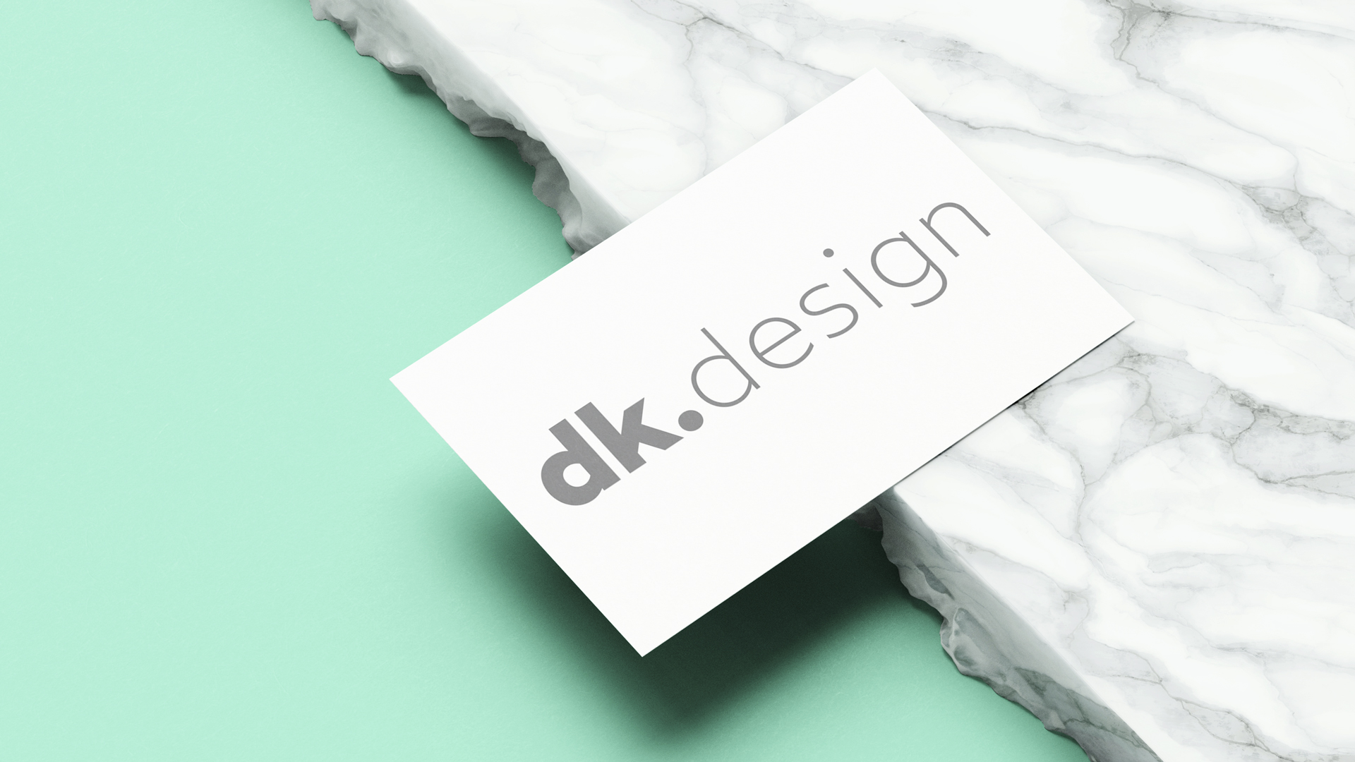
My own logo
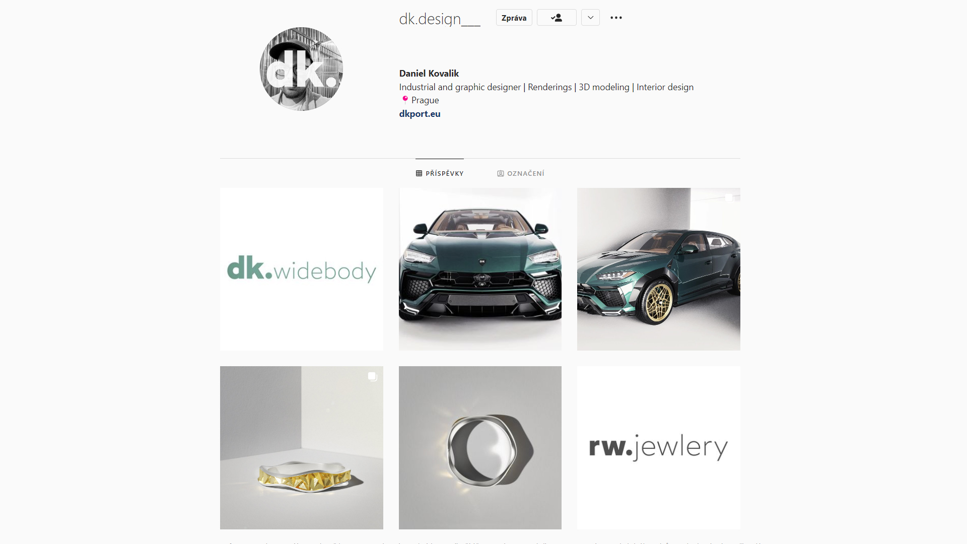
Over the time I have experimented and kind of evolved few of my own logo over last 5 years. But when I created my new Instagram on which I will be posting just my work I felt it needed a new logo which would express my way of creating things and love for minimalistic and modern looking logos.
I then came up with a logo build just on a strong and nice typeface from Atipo Foundry using just different typeface weights of the Wotfard font family. I would say the logo feels very current and minimalistic, and hopefully I won´t change it any time soon. On the IG page i came up with a style I would like to continue when adding my next projects with a label or title of the project, with the same theme as my logo.
_
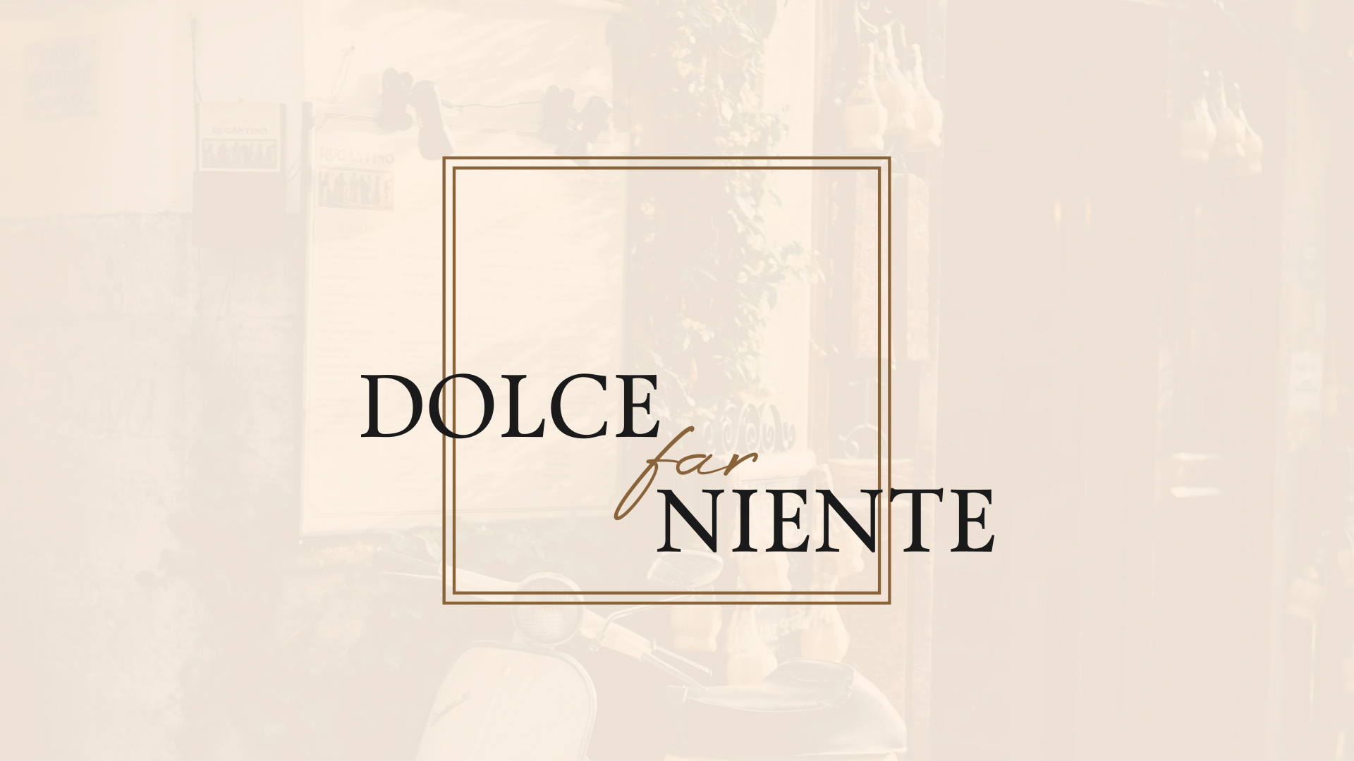
Dolce Far Niente restaurant
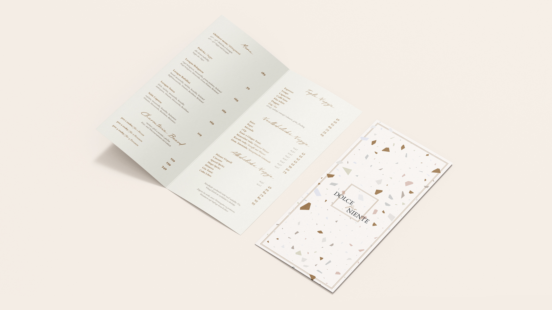
Dolce far Niente is newly opened small Italian restaurant located in the western part of Czech Republic in Cheb. This Project was completely given to me to design. From interior of the restaurant to a graphic identity and website. Interior design part can be checked out in interior design section of my website.
We had a pretty similar ideas about initial concept with the client and the logo was build rather quickly in a minimalistic form with emphasis on using nice and fitting fonts. To further express the Italian mood of the menu´s, I have created a stylized version of Italian terrazzo structure which I used on the outside of the menu, using toned down warm shades of brown colors. On the inside of the menu, I wanted to keep things minimalistic and just focused on ease readability and enough ¨breathing¨ space around each text section. Since the restaurant is planning to add a pizza on the menu, in the future the menus will be re-done to a tri- fold menu.
Last step of this project was to create and adjust an easy website for the restaurant. I chose online html template which I then adjusted to fit the overall theme of the restaurant and its logo. You can check the website Here.
_
MK Flower´s
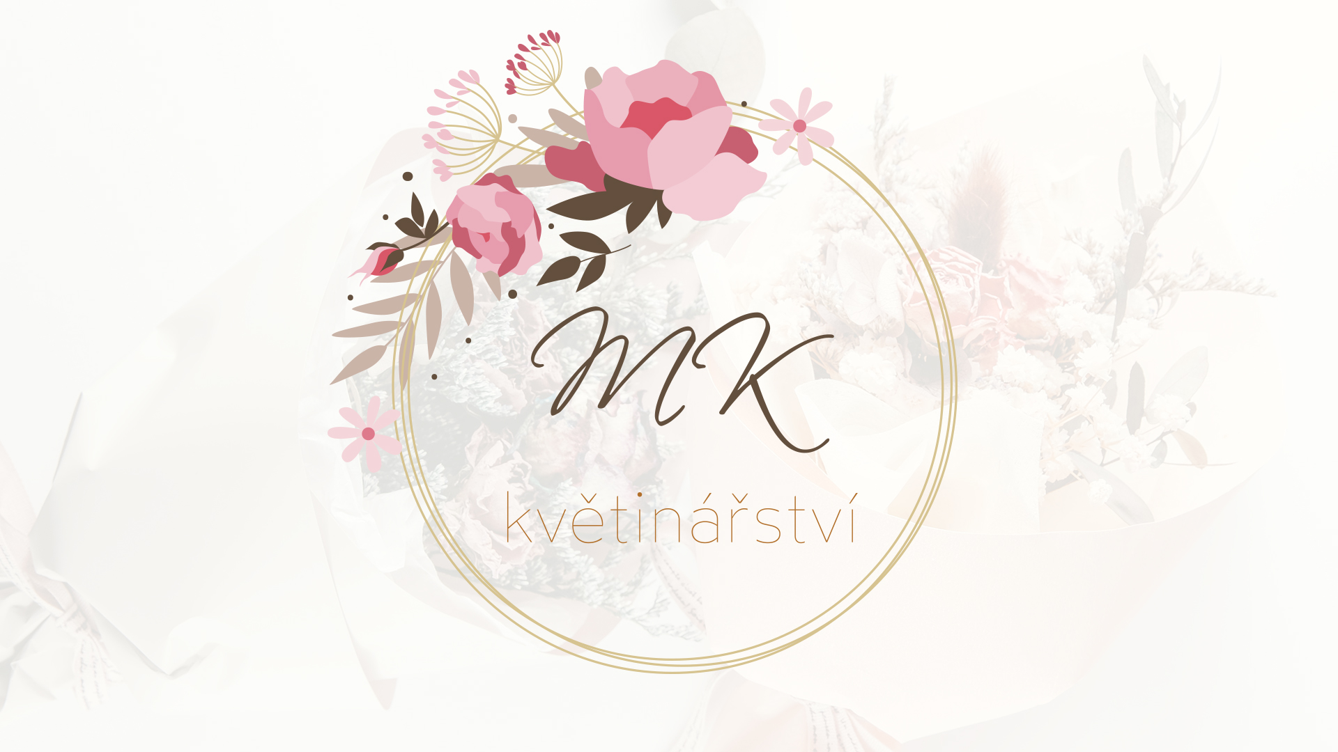
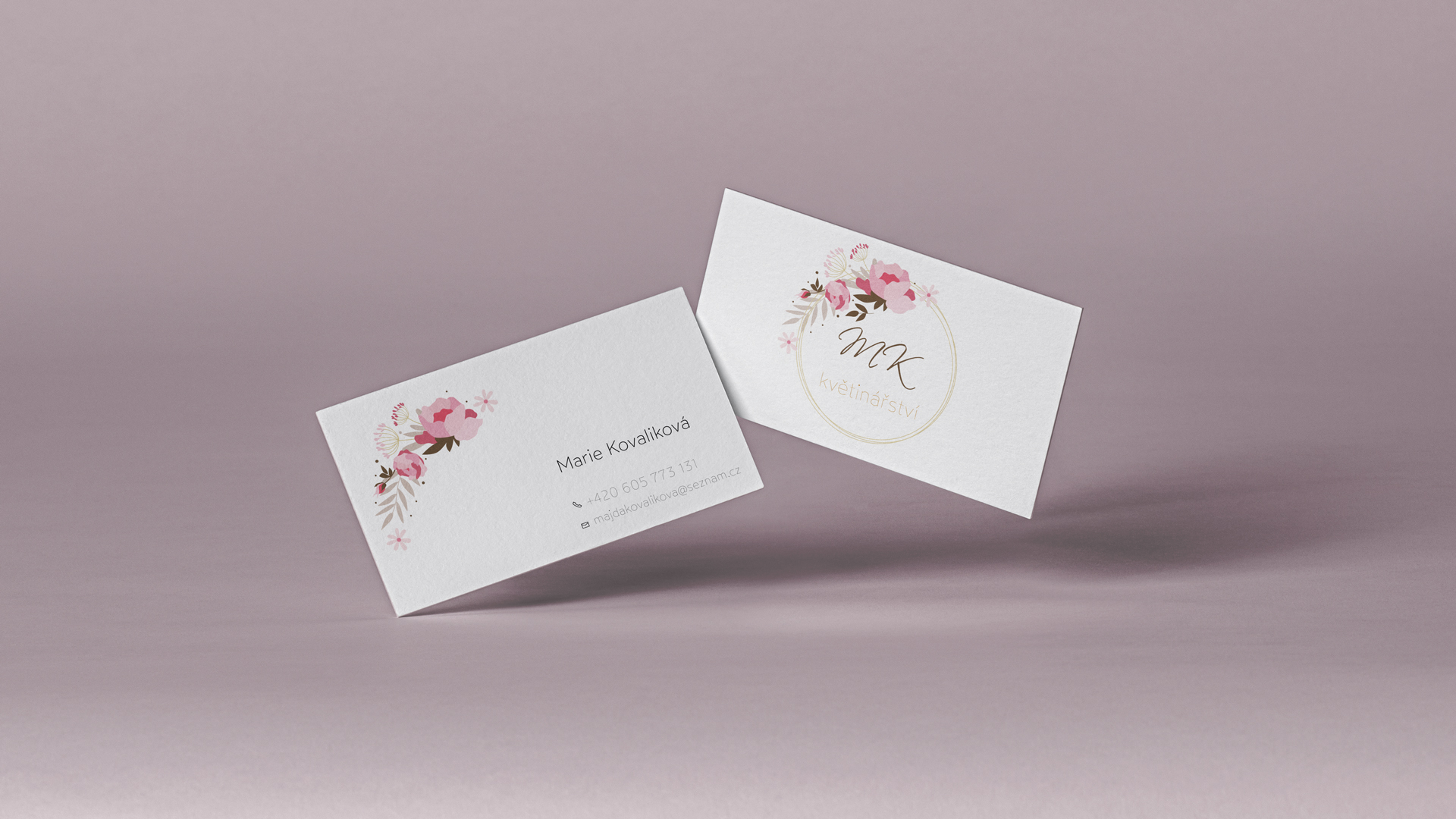
MK kvetinarstvi was a project that I did for my mother. She has opened a flower selling business at the beginning of 2022, so of course I had to design a beautiful and modern logo for it. I have chosen a circular theme of the logo since it seemed fitting to the circular pattern in which are usually bouquets made. I used warm and earthy colors that were complemented by a flower illustration. (which I modified from a vector file).

_
25 Nutrition Brand
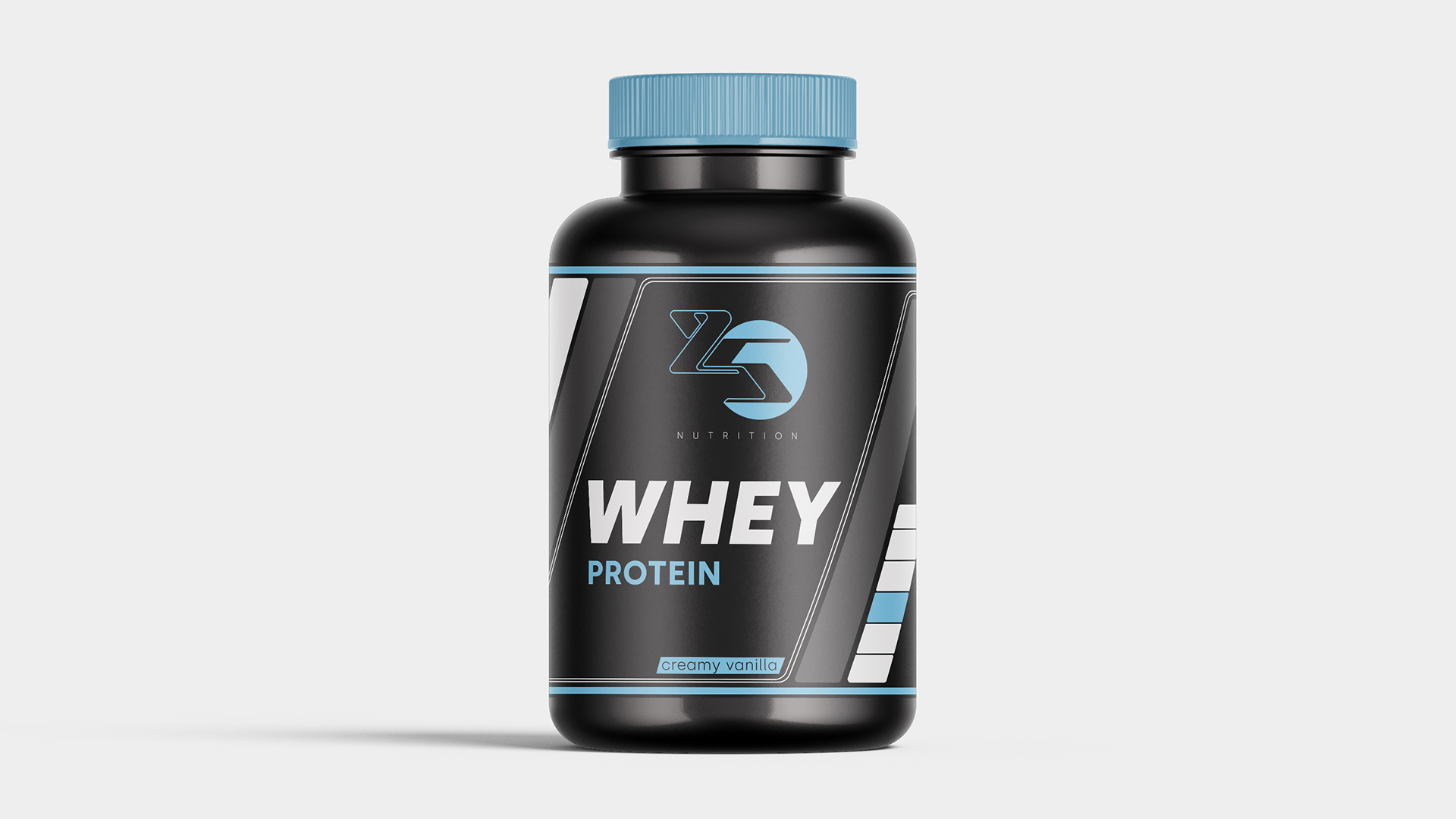
25 Nutrition is a newly established fitness product business in Benelux. I was approached to design new brand´s logo, product label design and help with the overall colors and feel of the brand.
I have designed dynamic looking logo that represents the numbers 2 and 5 and added the nutrition in modern and minimalistic font. The baby blue color is intertwined in the whole project since it was a requirement from the client. After the final logo was created, I have also made a sample label how the whole packaging should look. Which was then sent to a company that produced the packaging and powders for the client, where they added all necessary information. If you wish to check the brand here is a link on it´s Website.
_
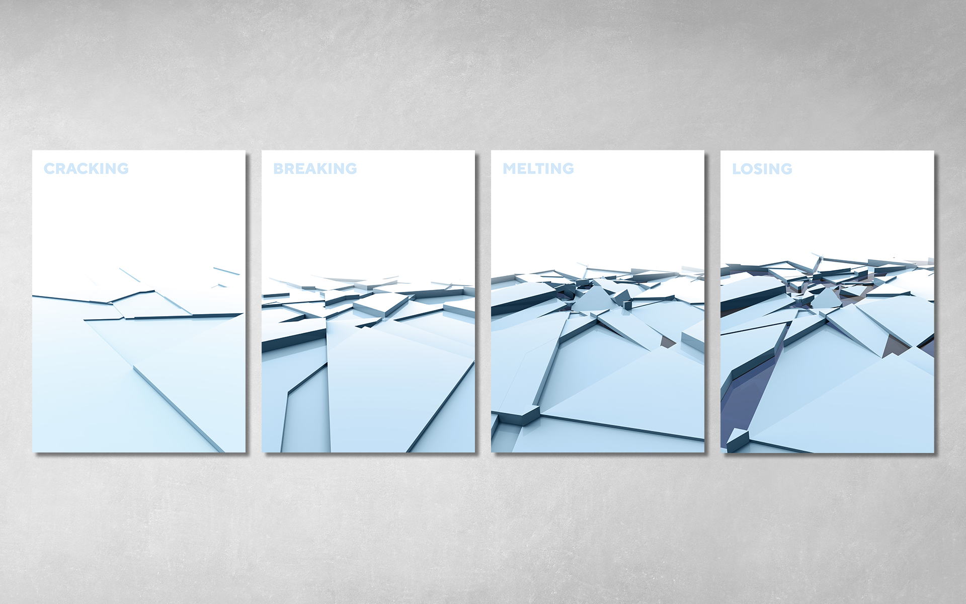
Set of posters for global warming campaign
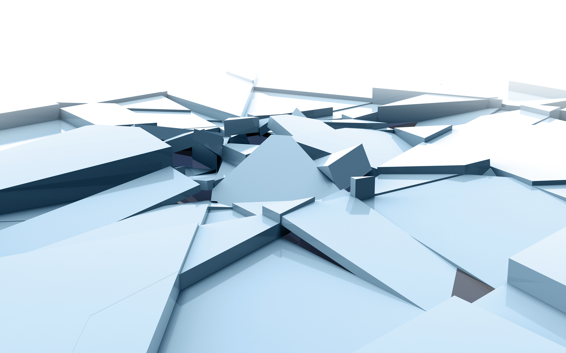
On these posters you can see slowly cracking and breaking ice accompanied by words which should strengthened the atmosphere of these problems. The graphic was made using Rhino 3d software and grasshopper plugin in which you can create generative design. I made those ice pieces in 3d and then rendered them.
This project was made during one of my school subject focused on graphic design. We got an assignment to came up with set of posters for global warming awareness. The technique and style were completely on us. But it should be made the way that these 4 posters correspond with each other.
_
Visual identity of Carbon Art company
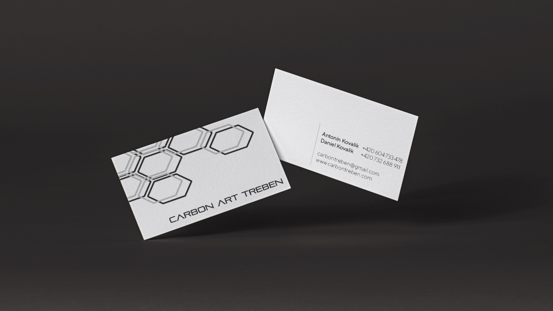
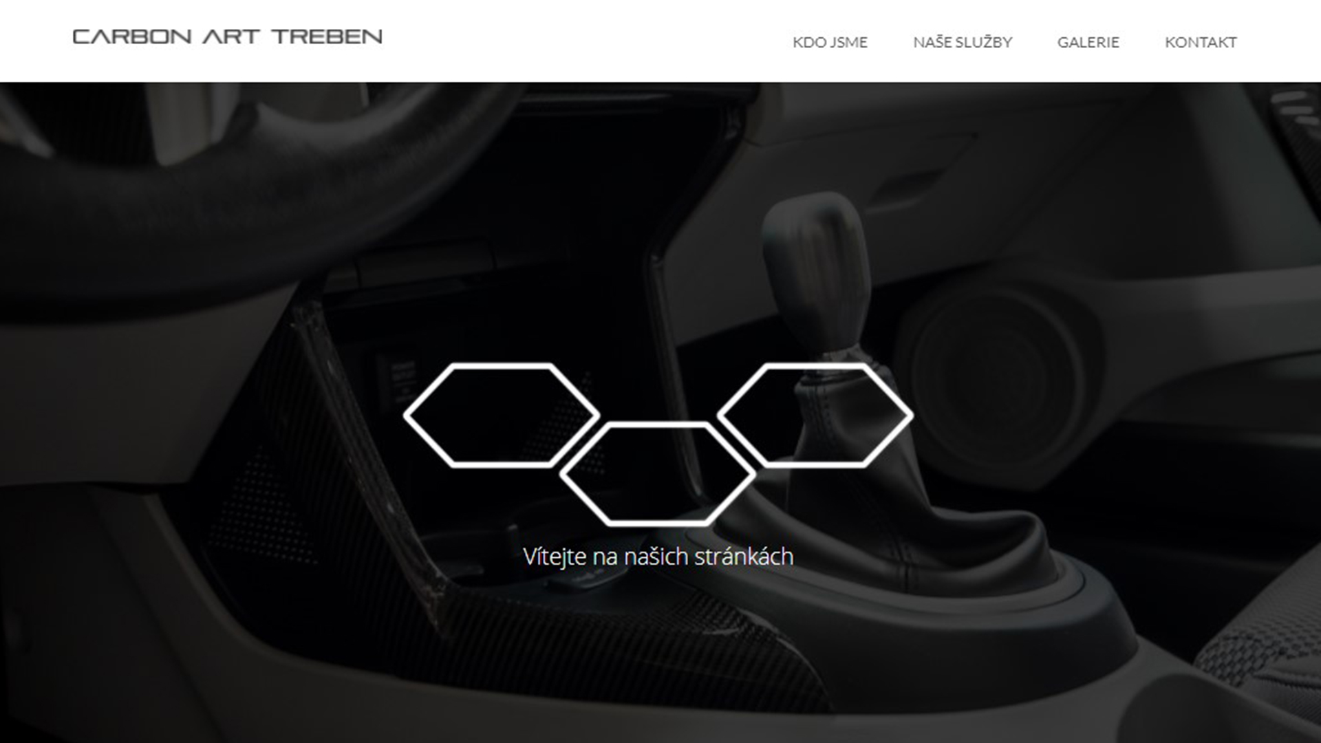
I have created whole visual identity for our company focused on making composite parts. From logotype, throughout stickers, business cards to whole web design. The design is minimalist in greyscale colors which suits well to the industry we are working in. The logo is used in 2 forms, one is just the company name made with sans serif font which can be accompanied by hexagonal graphic which links to the carbon hexagonal structure, this graphic varies with different applications. I then choose to create one-page web to contain all information about our business and some examples of our work.
You can check the whole webpage Here.
_
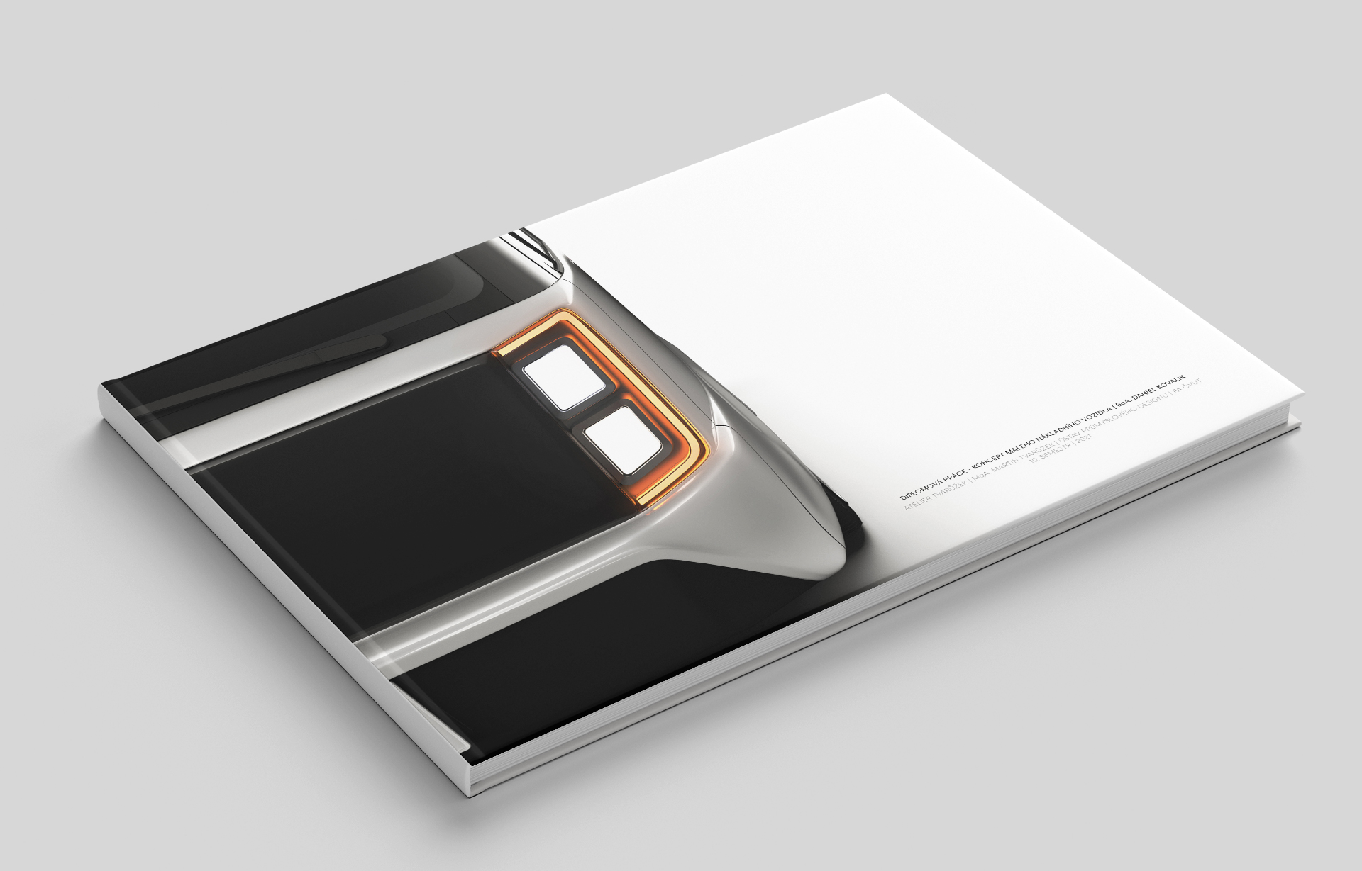
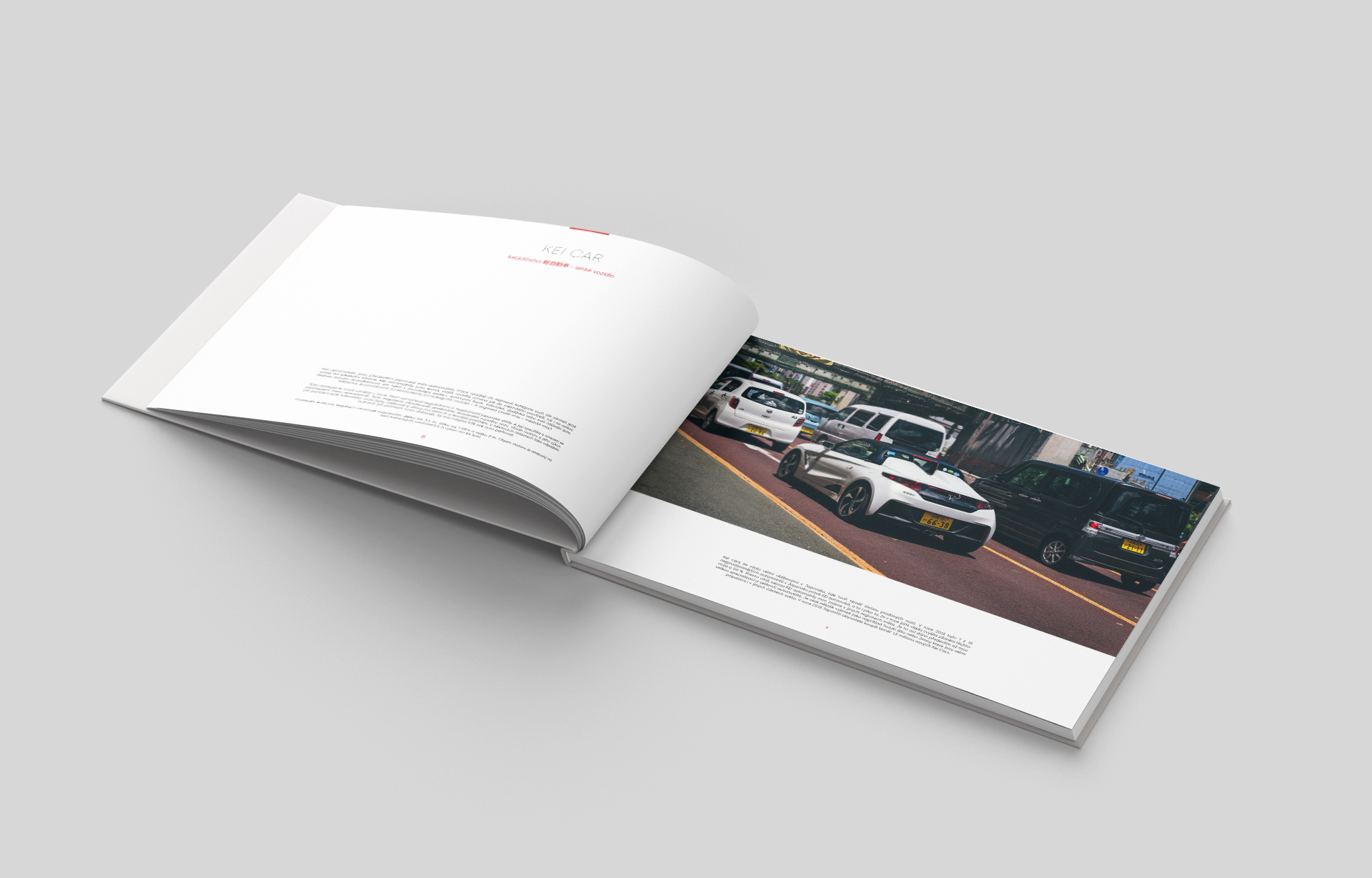
Diploma thesis portfolio
For my diploma thesis I created a portfolio that graphicly corresponds with its content. The product that I created was meant to be released under Honda Motor Co. Ltd. Brand. So, I wanted to use the same graphic language they used in they brochures and web pages. So, I created clean and minimalist portfolio using base colors which Honda uses which are red, white and greyscale. Paragraphs have always a lot of space around them so the text doesn’t feel overwhelming.
You can check the whole portfolio Here.
_
Fictional Poster
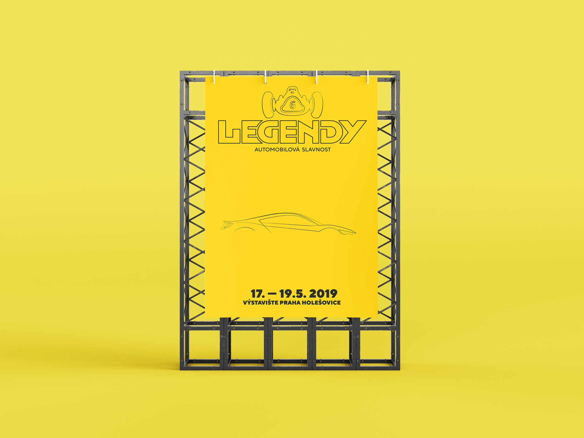
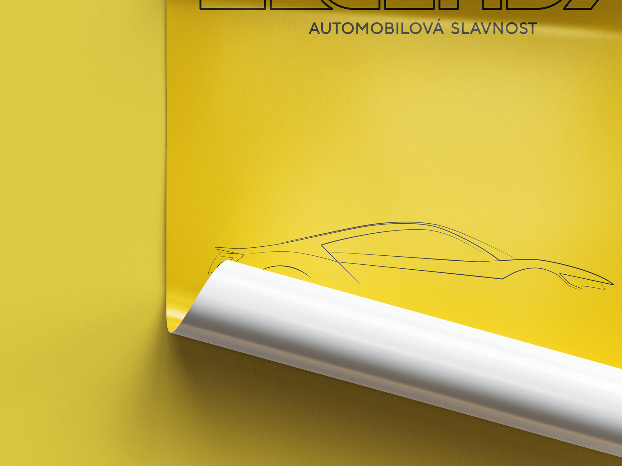
One of our school assignments was to create a redesigned poster for an event of our choosing. I chose event called Legendy, which is one of the greatest car-focused exhibition in Czech republic. I created minimalistic design with a car silhouette in the middle as the focus point. The silhouette was made by me in Adobe Illustrator as an exercise to work with lines.
_
After Effects
I have done a few projects inside Adobe´s After Effects. It was mainly some exercise projects where i could learn the basic navigation,effects and creating visuals, which supported my school project´s presentations.

_
Logos made for UIT projects.
These two logos are made for projects which are backed by UIT – The Arctic University of Norway. First one is Russian Constructicon which is a free open-access electronic resource that offers a searchable database of Russian constructions. The second one is Threat Defuser which is a multi-disciplinary project that combines state-of-the-art methodologies from political science, linguistics and media studies to forge new methodologies.